ShopDreamUp AI ArtDreamUp
Deviation Actions


Suggested Deviants


Suggested Collections


You Might Like…


Featured in Groups


Description
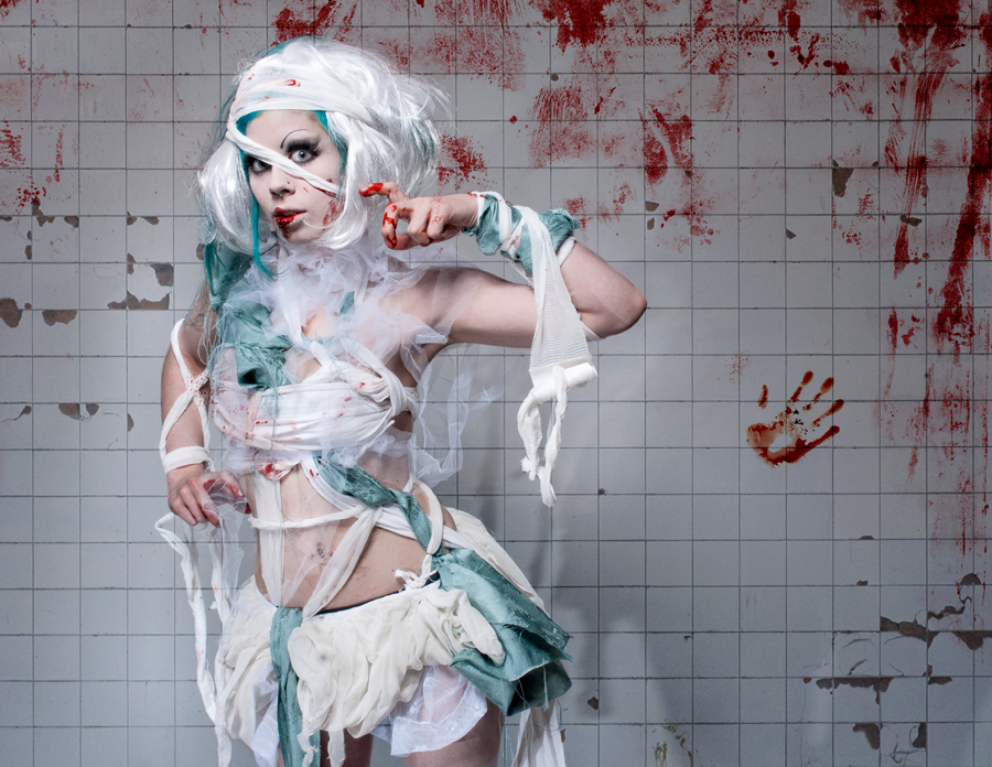
Photographer: jamari-lior
Model, make-up, styling, editor: myself
Model, make-up, styling, editor: myself
Image size
900x696px 581.8 KB
Make
SONY
Model
DSLR-A700
Shutter Speed
1/125 second
Aperture
F/14.0
Focal Length
28 mm
ISO Speed
100
Date Taken
Jan 29, 2009, 9:22:00 PM
© 2010 - 2024 Ophelia-Overdose
Comments151
Join the community to add your comment. Already a deviant? Log In
I didn't like this one as much as your others. Usually you look like you are naturally a part of the photos environment, like you belong there. Something about this looks too posed for lack of a better word. Like I can see you trying. "Trying" instead of "being". I think it is the look into the camera combined with the hand positioning. The look gives me a "Hey, does this look right" reaction. Still like it but it's almost like an artist trying to be you, almost there but not quite.
I like how the blood is off to the side and suggests of there being much more too see. For this character the suggestion is more powerful than total saturation. I also think that if all the blood was behind it would have the character not standing out as much. The more plane background right around you puts you out front and leaves the environment to do its job and create a "feel" for the characters world.
I would have liked either more dirt on the tile or flooded with light. The side lighting with the shadows and darkness away from the character gives a dark hidden away feel but the clean tile goes against that. More grime would show more commitment to the environment. Or, flooding with light would make the environment cleaner and less important and make the character and blood pop. Either would be preferred over being kinda in between.
Hopefully you can get a feel for how I see this piece. I know nothing about art so this is kind of an average Joe on the street reaction/comment/critique.